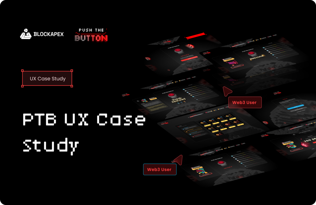
Push the Button (PTB) is all about turning a simple action into an exciting game. Designed for fans of both web3 and web2 games, PTB offers addictive gameplay where players can earn rewards, complete challenges, and dive into thrilling game modes. With two core game modes and a variety of events, PTB ensures that every push counts, making each interaction both strategic and fun.
Project Overview
Game Idea
The game is a competitive, blockchain-powered clicker experience incentivizes players by making strategic moves. The core concept is simple yet engaging: players push a button to accumulate tokens, but the depth comes from the different modes which will be discussed later in the case study, and events that challenge players to think strategically and act quickly.
Target Audience
The game is designed for a diverse audience, keeping in mind the extreme users, including casual gamers who enjoy quick rewarding gameplay, hardcore gamers like blockchain enthusiasts interested in token economies, and competitive players looking for strategic challenges.
Platform
It is accessible on web platforms, and as well as on mobile devices.
Objectives
- To create an engaging web3 feel gameplay experience that balances casual play with strategic depth.
- To increase player participation and retention through a variety of game modes and events.
- To drive revenue through in-game token transactions and premium purchases.
Problem Statement
Challenge
The initial version of the game appealed as a simple browser game lacking dynamic features, complexity, and engagement to retain players long-term. There was a clear need for more interactive and competitive features that would keep players invested and returning daily.
Market Gaps
- A need for more competitive game modes that allow for strategic play and decision-making.
- Limited options for players to engage with the game beyond basic clicking, leading to reduced long-term engagement.
- Insufficient customization and personalization features could hinder player loyalty and satisfaction.
Goals and Objectives
Goals
- Increase user engagement by 30% through new game modes and events.
- Boost daily active users by 20% with enticing features and frequent updates.
- Enhance revenue through token transactions and in-game purchases.
Key Performance Indicators (KPIs)
- User engagement metrics (session length, frequency of play).
- Revenue from $PUSH token transactions and in-game purchases.
- User retention rates and growth in daily logins.
Design Process
The design process involved a comprehensive overhaul from Web2 to Web3, focusing on creating a more decentralized, user-centric experience. This transformation was broken down into three key phases: Discover, Define, Ideate, and Design. Each step was essential in revamping the platform to embody the Web3 ethos, emphasizing user control and privacy.
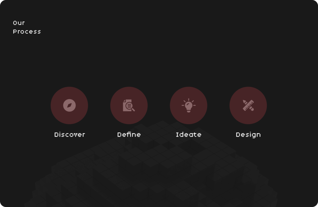
Discover
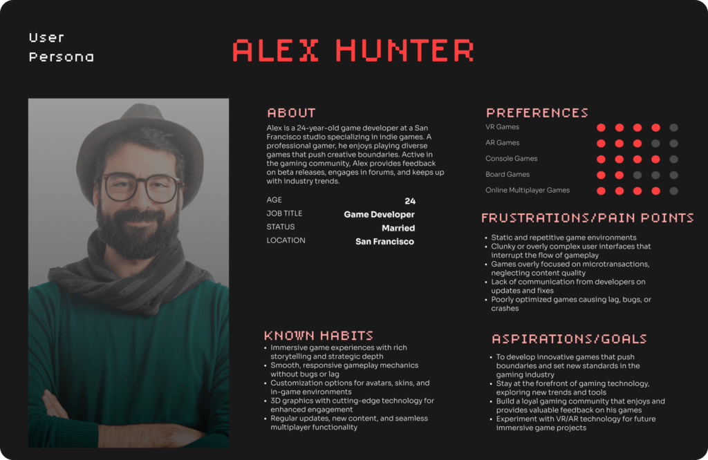
We started by researching and carefully analyzing the trends. Amongst which stood out, was the growing popularity of retro aesthetics in Web3 games and digital experiences. We recognized that this style not only evokes nostalgia but also aligns with the decentralized and innovative culture of Web3.
We identified that Web3 users prefer unique and visually distinct interfaces. To keep it user-centric, we focused on the feedback which was retro gaming. It stood out to our audience because it combines classic gaming vibes with new-age technology.
Define
Based on the user empathy map, their responses and the point of view, we refined the problem statement, especially for the design process.
Problem statement:
We needed to create an engaging, visually distinct interface that reflects the Web3 ethos while providing clear, intuitive feedback and navigation.
Objectives:
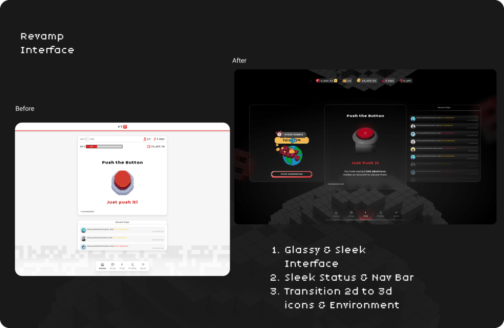
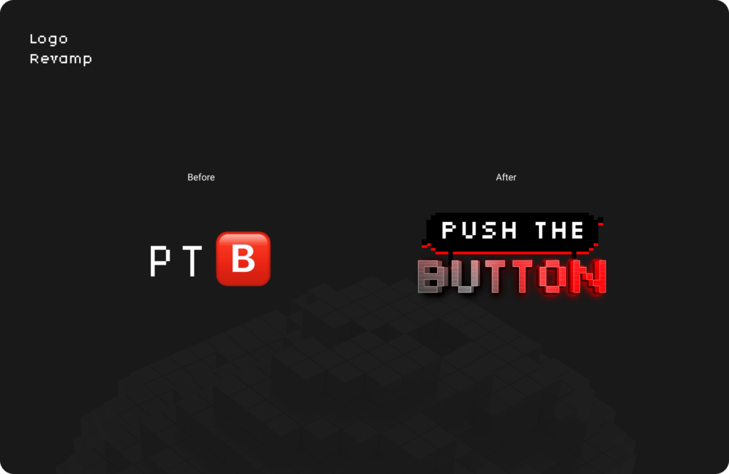
- We chose pixel-based fonts and icon styles to align with Web3 trends and attract users who appreciate a vintage yet contemporary feel.
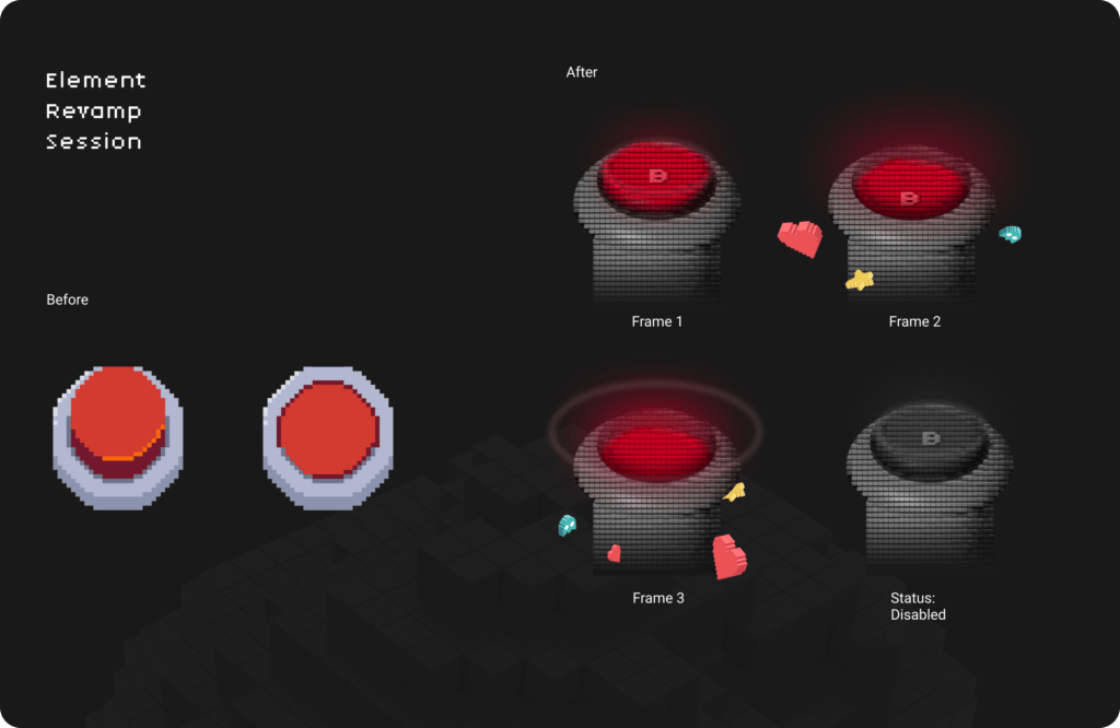
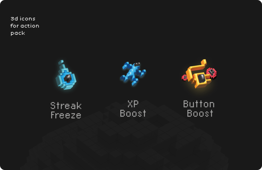
- We developed isometric-style icons to add depth and interactivity to game elements, enhancing user engagement.
- We ensured that the overall theme and background maintained a consistent visual experience inspired by retro designs.
Ideate
Design Style:
- We selected a pixelated font for all text elements, such as push counters, event names, and user stats, to enhance the nostalgic vibe.
- Our team created isometric-style icons for game actions (like pushes), events, and navigation elements to provide a dynamic and cohesive look.
- We designed a pixel-art background that reflects the game’s universe, using a color palette that compliments the game’s narrative and user interactions.
Visual Hierarchy:
We focused on the central push button, using a larger, animated design to immediately draw attention, while keeping the push history and events sections aligned to ensure a balanced visual flow.
Design
User Interface
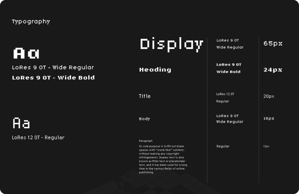
Visual Consistency:
We maintained a consistent retro style across all elements, —from the navigation bar to the top stats and event details—ensuring a cohesive and engaging user experience.
Red and black color theme was chosen. Red is used to draw attention to critical elements, such as the primary “Push” button or important alerts. Red’s boldness captures the urgency and excitement of the game’s core mechanic. Whilst, Black is used to draw stark contrast, used for text, icons, or elements that need to stand out against a lighter background. It also adds a sleek, modern look to the interface.
Interactive Elements: We incorporated subtle animations and effects for 3D icons and buttons on hover or click, enhancing interactivity and making the design feel lively and responsive.
User Testing Feedback: After gathering feedback on the retro style’s impact, we iterated on the color palette, icon design, and font readability to strike a balance between accessibility and aesthetic appeal.
User Experience
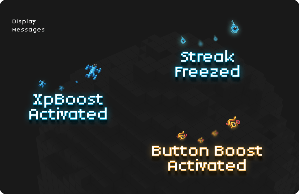
- The user interface will prominently display the current timer, remaining pushes, and jackpot amount, providing players with essential information to make informed decisions.
- Notifications will alert players when the game is nearing its conclusion, prompting them to strategize their final moves.
- A leaderboard will showcase the top contenders and their progress throughout the game, adding a competitive element to the experience.
Prototype
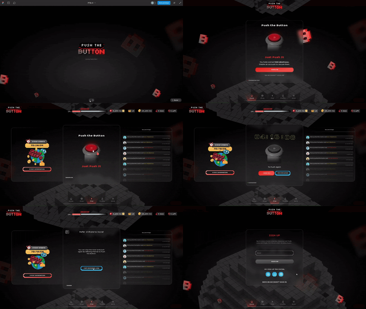
Game Modes
Free to Play Mode:
- The basic game mode is available, allowing players to earn between 1 to 5 Buttonz per push.
Last Push Wins Mode:
- Entry and Pushes: Players pay $10 in $PUSH tokens to enter and receive 10 pushes.
- Initial Timer: Starts with a 12-hour countdown.
- Time Extension per Push: Each push extends the timer by 2 seconds, with a maximum extension cap of 12 hours.
- Endgame Condition: The game ends when a player makes the final push with their last available push, or the timer runs out and extends by 5 minutes.
- Jackpot Funding: The prize pool is funded by trading fees.
- Maximum Frequency and Cooldown: Players can participate once every 24 hours, with a cooldown that increases by 30 minutes per push.
Game Selection
- Players can now select between the Free to Play and Last Push Wins modes directly from the homepage.
- Game Mode Selection Cards: Visually distinct cards have been designed for each game mode, with clear titles, brief descriptions, and icons for easy identification.
- Home Page Integration: The game mode selection is prominently displayed on the homepage, ensuring it is easily accessible and immediately visible to users.
Events and Raffles
Global Tapping Event:
- A month-long event has been added with a dedicated leaderboard to track progress.
Daily Loot Raffle:
- Players can purchase raffle tickets with Buttonz to enter daily loot raffles.
- Rewards include $PUSH, $BUTTONZ, and power-ups, with a dynamic display of the reward pool and ticket costs.
- Users can view past results and claim rewards through the game’s wallet interface.
Premium Features
Premium Booster Pack:
- Limited edition booster packs are available weekly for the top 250 participants, containing rewards like Buttonz, $PUSH, SOL, and NFTs.
Customization:
- Users can purchase and customize background and button skins for $5 each.
Minor Enhancements
- Streak Rescue Pricing: Dynamic pricing for streak rescue is now displayed via a pop-up.
- Power-up Labels: The shop interface now includes clear labels to differentiate between bronze, silver, and gold power-up categories.
- Level-Up Notifications: Players receive a one-time pop-up message upon leveling up, indicating the amount of $BUTTONZ earned.
Conclusion
This case study showcases a thoughtfully designed platform aimed at optimizing user experience through strategic gameplay features and intuitive UI/UX elements. By integrating distinct game modes, dynamic events, and a clear reward system, we ensure user engagement and satisfaction. The technical framework supports real-time updates and interactive elements, while UI/UX refinements enhance visual clarity and ease of use. Collectively, these enhancements delivered by BlockApex showcase a seamless, immersive, and user-centric experience.

